The site is rolling out a handful of updates to the way YouTube not only looks but works, Chief Product Officer Neal Mohan said in a post. Many of the changes build on recent updates.
According to a blog post on the official YouTube blog, the company has detailed that this revamp is rolling out in parts.
“Over the last few months we’ve started releasing updates and will continue to throughout the rest of the year,” Mohan said in the post. “When all is said and done, we’ll bring a new level of functionality and a more consistent look across our desktop and mobile experiences.”
Mobile features
With these new changes it seems YouTube intends to keep update itself for an era where smartphones are used more to watch videos.
For the mobile user, YouTube now allows the user to rewind or fast forward a video by tapping on the left or right side of the screen. Similarly, the user can switch to previous or next video by swiping either to the right or to the left.
There are also reports that YouTube is working on the section that shows the suggested videos on the side along with other new features.
While the desktop already lets you speed up or slow down playback, YouTube is also rolling out that same capability to mobile.
Plus, YouTube will now adjust to fit the video format you’re watching. So if the video is vertical, the player will become vertical. That feature comes as more viewers — typically younger ones — are comfortable with watching vertical video thanks to services like Snapchat and Instagram.
Design changes
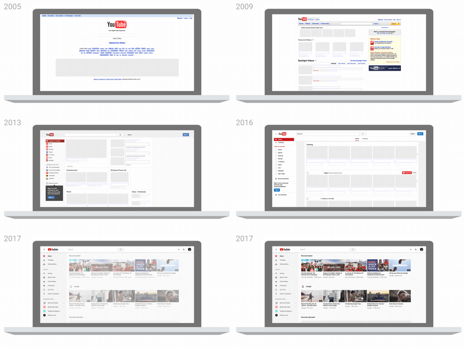
Most changes have been made in the design and layout of the site apart from several features in both desktop and mobile versions.
The company has now included a video play button before the word YouTube in its new logo. The change will be applicable on both mobile and desktop versions.

The site will now have several new features like type face, colour scheme among others. The new colour schemes are being rolled out on both Android and iOS mobiles.
Besides the changed logo, the app will now have a white background. Major changes have been made on the navigational tab which has been shifted to the bottom. The app will now also have a new library and an accounts tab.

Taking on Netflix and Amazon
The updates come as YouTube, a unit of Alphabet’s Google, presses its lead in online video with a subscription service called Red and a live-TV service called YouTube TV.
The service is trying to expand beyond user-created videos and into more professional content, better enabling it to compete with the likes of Netflix, Amazon and Hulu, which are all also investing in their own shows and movies.
