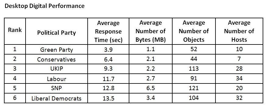
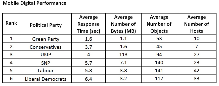
When it comes to website design, The Green Party is firmly in the lead, whilst the Lib Dems are lingering in last place, according to new research.

The tests carried out by Dynatrace looked at political party websites in the run-up to the General Election, to find out who’s winning when it comes to digital performance.
Other key findings include:
• Annoying splash pages delay the visitor journey: The Labour Party, Conservative Party and Liberal Democrats homepages all redirect visitors to a splash landing page, designed to capture contact information and voting intent – which adds an additional step that visitors’ must click past before they can reach the page they want.
• Green Party follows best practice to take the lead: The Green Party has the lightest website overall, following a number of key web design best practices to minimise the complexity of its homepage and ensure a slick experience for site visitors.
• Tories grab second place by leaning on fewer hosts: Despite the presence of a splash page, the Conservatives managed to score second place due to the low number of third-party hosts that its website relies on to serve-up content.
To create the benchmarks, Dynatrace monitored the speed with which potential voters are able to access the homepages of the Conservative Party, Labour Party, Liberal Democrats, UKIP, Green Party and SNP websites, over a seven-day period. It then analysed the results and looked at how effectively the sites have been designed for performance; revealing what the user-experience was like for those trying to access the homepage as they search for information to help them decide where to cast their vote on June 8th.
“As recent elections have shown, digital technology is playing an increasingly important role and exerting more influence on the electorate’s decisions come polling day,” said Michael Allen, VP EMEA, Dynatrace. “The web is often the first place that we look for the information we need to make the biggest decisions in life; from buying a car, to booking a holiday or choosing a leader for our country.”
“As such, each of the parties vying for Number 10 should remember the old adage that first impressions really do count. Delivering a poor experience to anyone looking for information on the party website in the lead-up to an election could ultimately result in a lost opportunity to convert visitors to voters. Each party should therefore ensure its website is optimised to deliver the best possible user-experience, especially as we get closer to the wire and web traffic increases.”
The Green Party has the lightest website overall; with the lowest byte count, a low number of objects (content such as images, videos and social media plugins that load on the page), and few hosts (third-party content providers that serve up the page objects). This minimises the complexity of its homepage and contributes towards the slick experience being delivered to site visitors.
Conversely, the Labour Party, Conservative Party and Liberal Democrats homepages all redirect visitors to a splash landing page, designed to capture contact information and voting intent. This adds an additional step – delivering further objects from more hosts, which site visitors must complete, or click on a button to bypass, before they are able to access the homepage. As such, their user-experience is less optimised, with a delay to their journey to the homepage.
The full data from the benchmarking tests follows:


“It’s interesting to see that there is such a variation in the build quality of the various party websites from the user-experience perspective,” continued Allen. “In particular, it’s worth noting the traditional mainstream parties have a splash page to capture voter data and intent. The drawback to that is the delay for the user in getting to the main website. It’s always worth weighing up whether the potential gain from introducing features like this will outweigh the negative impact on user-experience.
“However, despite that, the Conservatives have managed to keep response time pretty low, probably because it has so few hosts. The other thing that jumps out is the size of the UKIP site on mobile devices, which seems to relate to a recent Facebook video. High byte, object and host counts can have a draining impact on the user-experience, so it’s best practice to keep those to a minimum. This is particularly true on mobile devices, where the network connection is not always consistent.”
If latest YouGov polls are to be believed, the outcome we’ll see on the 9th June is far from certain. However, recent election campaigns at home and abroad have underlined the importance of user-experience and digital capabilities as key weapons in the arsenal of all 21st century political parties.
Methodology: Dynatrace ran hourly automated tests between 23rd May and 30th May 2017, to track how quickly potential voters are able to get onto the homepage of each political party when they enter its URL into a browser on their desktop or mobile device. Where a splash page was encountered, the tests were configured to take the shortest possible route to reach the homepage, using the option provided to proceed directly to the main page without the user entering any data. The tests were conducted using Dynatrace to take measurements for a user on a desktop PC or laptop with a high-speed internet connection in the UK, and a mobile device with a mobile network connection in the UK.
